
4 Components of Visually Appealing Web Design & Why it Matters
By Erin Neisewander - eGuide Digital Manager
Small organizations often need the ability to launch a concept on a shoestring budget, and as we’ve seen firsthand, hard work, networking, and word-of-mouth will be the biggest driver of your organization’s website traffic in the early stages. So if you have made the decision to go it alone, we want to equip you with some key components that will have your site standing out against your competitors.
Component One: Branding
BRANDING: Logo
A company’s logo is its most recognizable asset, it’s a small part of the overall branding but it is the visual key that will catch a client's eye. Consistency in logo usage across all marketing platforms is a major point of design especially when it comes to a website.
Using your logo in your header near your main navigation is a great way to start your website with that key brand recognition. Here you will most likely want to use the primary logo design and then throughout the remainder of the site you can bring in your secondary logos or logo marks that are associated with your brand.
The footer of your website is also a key place for a logo to live as it is the last thing a visitor will see when they are done scrolling through and a perfect place for a last impression of your business.
Be careful not to overuse your logo or marks just for the sake of using them. Over-usage can cause confusion and clutter to your website design.
BRANDING: Colors & Fonts
Just like a logo, color and font consistency throughout your website will help not only the design stay on track, but help build the recognition that will keep a customer coming back.
The general rule of thumb for color is to try and keep it to 3-5 different colors so as not to overwhelm or “muddy” things up. Stick to the colors that you have built out for your brand and use them in a clear and concise manner that makes sense to your brand.
For example, you might keep all your Header text in one color while your paragraph text is in another. It could be the same with buttons, having them all the same size and color is a great idea for design as well as usability. Consistency in color and font usage will help the design feel more complete and cohesive.
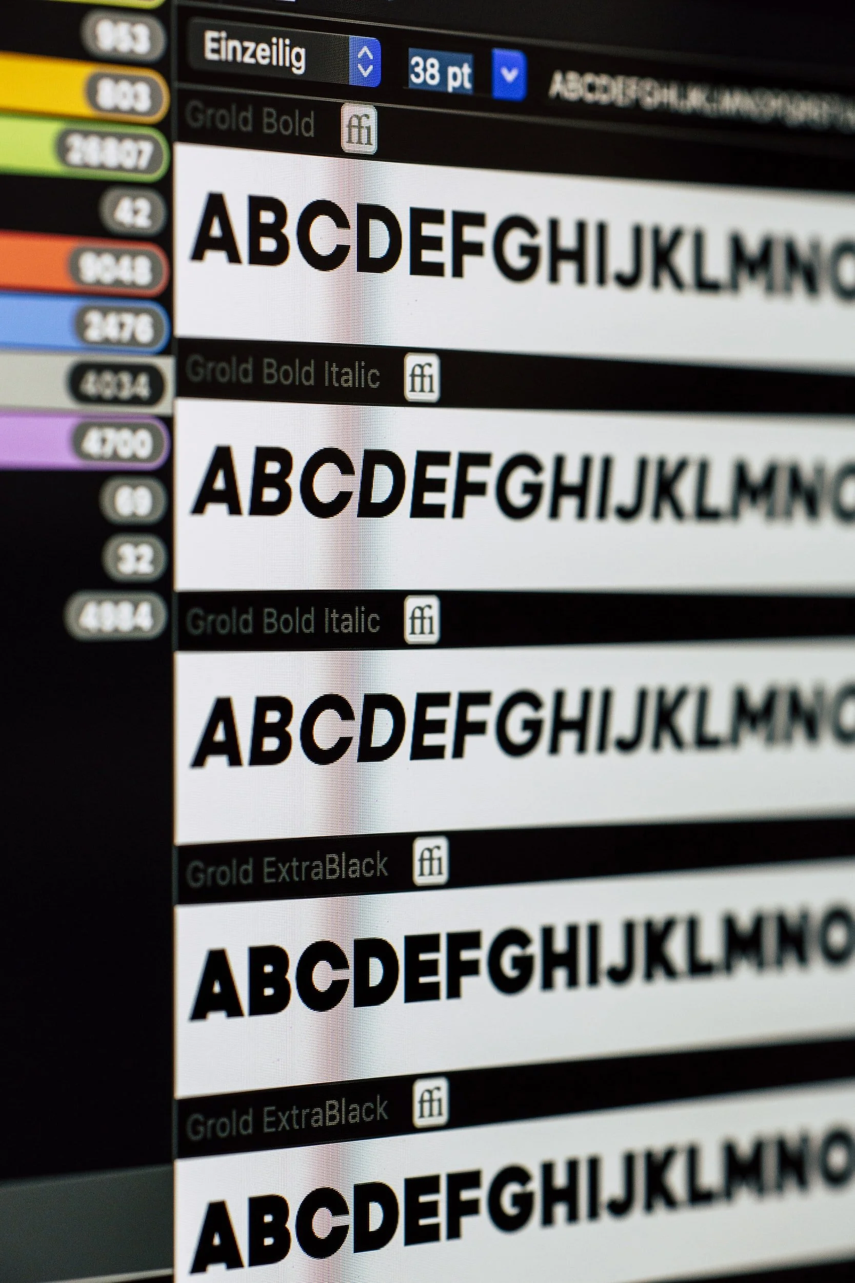
The same applies to fonts. Try not to use more than 3 fonts and create a hierarchy with fonts using bolder/larger fonts for the headers while using smaller regular-weight fonts for the longer body copy text.
Component Two: Consistency
We have talked about consistency “consistently” (see what I did there?) throughout this blog. Needless to say…it’s a SUPER important part of any website design.
Not only is consistency KEY, but it will also drive your design to that next level and keep you looking professional throughout.
Regarding Fonts, Colors, and Logo usage, always keep those in mind when you are creating your layouts. Some questions to ask yourself “Do all the pages look like they belong together?”, “Does the website flow from one page to the next?”.
Component Three: Usability
This is a BIG one. Your website MUST be user-friendly.
Try keeping it simple and utilizing a CTA (Call to action). These can be buttons, links, etc used throughout your site to lead someone to another page, an informational download, a contact or sign-up form, or even a direct link to an email.
You want to make sure your customers can easily navigate through your entire website.
Keep your navigation clean with short and straightforward titles The same with subpages. Put yourself into your customers’ shoes.
Component Four: Complexity
Usability leads us right to our final component, complexity.
We don’t want to overcomplicate the design or navigation as we have learned above so simplicity is going to be your best friend, not only for user-friendliness but also with any updating you may need to do down the line.
Simplicity is key to a point. However, make sure you are staying consistent with your branding and design. An appealing website that your customers will want to come back to shows that your business is ready for work!
Help Someone. Have Fun, Be You. Learn & Teach. Finish What You Start.